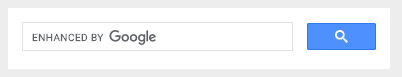
デフォルトのままだとこんな感じ。
なんだか余白が多いし、余白を作るにしてもこちらで指定したいところ。
今回はこれをカスタマイズして、
こうします。
まずは余白がどんな感じになっているかまとめてみました。
そんなのどうでもいいからスタイルシートが知りたい方はどうぞ読み飛ばしちゃってください。
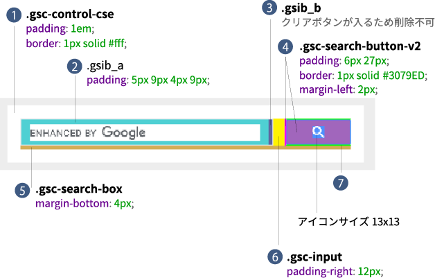
まず気になるのは、(1)のボーダーと余白。
これは設置するサイトによって変わってくるところなので、デフォルトとしてはいらないなー。
(5)のマージンの必要性もわからん。
もっとも気に入らないのはボタンの高さがフィールドの高さと違うところ(4)(7)。
フィールドの高さは line-height: normal; font-size: 16px; で結果として高さが 18px となっているだけ。
このままだと親に設定された line-height の影響を受けるので、おそらくほとんどの人はフィールドの高さがボタンより高くなったりして揃わない。
ちゃんと(2)の高さを指定してあげて上下の padding は 0 にした方がわかりやすい。
(3)は何かしら入力するとそれを消すための「×」アイコンが出現するためのもの。
.custom-search 内に埋め込んだ場合の例。
基本的に line-height の影響を受けないようにしたい要素はブロックレベルにしてあげる。
.custom-search * {
	box-sizing: border-box;
}
// (1)の余白、ボーダー背景をなくす
.custom-search .gsc-control-cse {
	background: none;
	border: none;
	padding: 0;
}
// (5)のマージンをなくす
.custom-search table.gsc-search-box {
	height: 31px;
	margin-bottom: 0;
}
// (6)フィールドとボタンの間のマージンをなくす
.custom-search td.gsc-input {
	height: 100%;
	padding-right: 0!important;
}
// フィールドのボーダーを変更
// SP 時にフィールドが角丸になる&余白が増えるのを防ぐ
.custom-search .gsc-input-box {
	border: 1px solid #000;
	border-radius: 0;
	height: 100%;
	padding: 0;
}
@media only screen and (max-width: 600px) {
	.custom-search .gsc-input-box {
		border-left: 0;
	}
}
.custom-search table.gsc-input {
	height: 100%;
}
// フィールドの左右の余白を調整
// フィールドの高さが29pxになるように調整※ボーダーと合わせて31px
.custom-search .gsib_a {
	height: 100%;
	padding: 0 10px;
}
.custom-search input.gsc-input {
	display: block;
	font-size: 16px;
	height: 100%!important;
	-webkit-appearance: none;
}
// クリアボタンの高さが29pxになるように調整
.custom-search .gsib_b {
	height: 100%;
}
.custom-search .gsst_b {
	height: 100%;
	padding: 0;
}
.custom-search .gsst_a {
	display: block;
	height: 100%;
	padding: 0;
	text-decoration: none;
}
.custom-search .gscb_a {
	align-items: center;
	color: #000!important;
	display: flex;
	font-size: 24px;
	height: 100%;
	justify-content: center;
	line-height: 1;
	width: 29px;
}
.custom-search td.gsc-search-button {
	height: 100%;
}
// 検索ボタンの高さが31px になるように調整声※13px + 9px + 9px = 31px
.custom-search .gsc-search-button-v2 {
	align-items: center;
	background: #000;
	border: none;
	border-radius: 0;
	display: flex;
	height: 100%;
	justify-content: center;
	margin-left: 0;
    padding: 0;
	width: 31px;
}
.custom-search .gsc-search-button-v2:hover {
	background: #000;
	opacity: 0.5;
}
.custom-search .gsc-search-button-v2:focus{
	background: #000;
	border: none;
	border-radius: 0;
	box-shadow: none;
	outline: none;
}
// SP 時に検索ボタンのアイコンがサイズアップするので 13px に固定する
.custom-search .gsc-search-button-v2 svg {
	display: block;
	height: 13px;
	width: 13px;
}
長い!